Chapter 3 - Measures of affordability
3.1
House prices have increased markedly in recent years, by much more than
consumer prices or incomes.
Chart 3.1
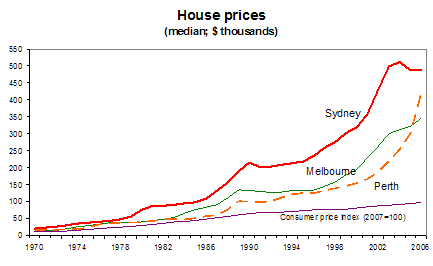
Source: Secretariat, based on
splicing ABS house price data from ABS Cat no. 6416.0 to earlier
estimates from Abelson and Chung (2004); the CPI series was constructed by splicing data from ABS Cat no.
6401.0 to that in the ABS 2008 Australia Yearbook.
3.2
By 2007 the average house price in the capital cities had risen to over seven
times average earnings.
Chart 3.2
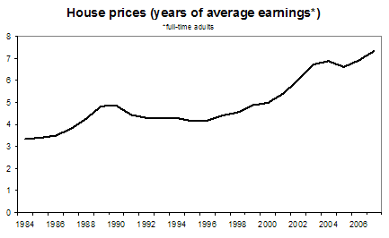
Source: as for chart 3.1, and ABS Cat no.
6302.0.
3.3
By this commonly-cited measure, housing affordability has deteriorated
quite sharply over the past decade.[1]
3.4
Another commonly-cited measure is the 'affordability index' compiled by the
Commonwealth Bank and the Housing Industry Association, which also takes into
account the level of interest rates. This index, shown on the left-hand side of
the following chart, is now at its lowest in the 23 years for which it has been
compiled.
Chart 3.3

Source: Richards
(2008).
3.5
The CBA/HIA index is calculated as the monthly loan repayment on a
typical 25‑year mortgage loan large enough to pay 80 per cent of the cost
of a house with the median price paid by first home-buyers, relative to
household income.
3.6
Professor Yates (2007) stresses the 'deposit gap', which is shown in the
right-hand panel in the chart above. This is the amount by which the average
house price exceeds the amount which a household on the average income can
borrow. This gap is now at record highs, which she suggests means that many
Generation X families will only be able to buy a home if they are assisted by
their parents. The longer this generation defers the purchase of a home, the
fewer working years they have to repay their mortgage. There will also be
pressures on those who do not buy and continue to rely on the private rental
market:
What is going to happen as a result of these people not getting
into homeownership in their under-40s as they go through to being over-60s? And
because the public or social housing system is stable, it is not growing, as
the population grows, what are the implications of that as the population
ages?’ What you find is you get more people in housing affordability stress and
these are the people who are in the low-income households because they have
gone past their earning age. They will be back on the pension levels of income,
they will still be in the private rental market and there will be higher levels
of problems amongst them. So that is something, looking forward 40 years, that
is going to be a bigger problem unless we do something about it now.[2]
These longer-term inter-generational issues are discussed in
chapter 11.
3.7
A related approach is the UDIA/Matsuik measure, whereby a housing market
is classified as 'unaffordable' when a household spending 30 per cent of the
average income in that region on repayments (and with a 10 per cent deposit)
could purchase less than 15 per cent of the houses in the region. On this
measure there were no 'unaffordable' regions in Australia in 2001 but over a
quarter of regions were 'unaffordable' in 2006.[3]
3.8
The Reserve Bank recently developed a similar measure, concluding:
on a nationwide average basis around 33 per cent of transacted
dwellings would have been accessible to the median young household in 2006/07,
compared with a longer‑run average of around 45 per cent.[4]
Chart 3.4
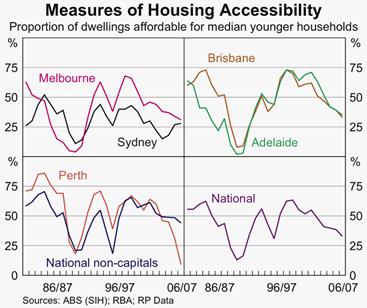
Source: Richards
(2008).
Mortgage stress incidence
3.9
Closely related to 'affordability' is the concept of 'mortgage stress'.
Indeed, one definition of 'affordable housing' is that it is housing which
would not put the buyer into mortgage stress.
3.10
The concept of 'mortgage stress' refers to current rather than aspiring
homebuyers. As home prices have increased, the size of the average mortgage has
risen, taking household debt to a record proportion of income.
3.11
As a result, even when mortgage interest rates reached their recent low
point of around 6 per cent in 2002, the proportion of household income going on
home loan repayments was still relatively high. Reflecting the larger
mortgages, home loan interest payments are now a higher proportion of income than
when housing interest rates peaked at 17 per cent in 1989. In addition to this,
an increasing number of households are paying interest on an investment
property. Some 'consumer' debt, such as credit cards, may also be being used to
fund housing.[5]
Chart 3.5

Source: RBA Financial
Stability Review, March 2008.
3.12
Financial institutions have traditionally applied a rule of thumb of not
allowing households to take out home loans requiring more than 30 per cent of gross
income to service.[6]
A government inquiry which looked into housing in the early 1990s concluded
that people on low incomes could not afford to pay more than 30 per cent of
their income on housing.[7]
This proportion has since become a benchmark.
3.13
In 2005 median debt-servicing ratios were below this benchmark for
almost all income groups. Lower income households have higher debt-servicing
ratios (Chart 3.6). These did not increase between 2002 and 2005, but
subsequent interest rate rises will have since pushed them up somewhat.
Chart 3.6
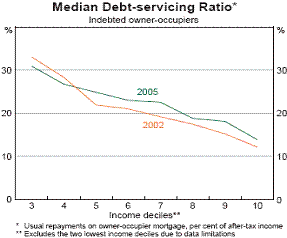
Source: Reserve Bank of Australia, Financial
Stability Review, March 2007, p. 26.
3.14
The averages in Chart 3.6 hide the number of households who are above
the average. The distributions in both 2002 (left hand column) and 2006 are
shown in Chart 3.7.
Chart 3.7
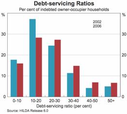
Source: Reserve Bank of Australia, Financial
Stability Review, March 2008, p. 54.
3.15
In 2005–06, around 23 per cent of households were spending over 30 per
cent of their income on housing (either mortgage repayments or rent), up from
19 per cent in 1995–96. Table 3.1 shows some of the groups in the community
with above‑average proportions devoting more than 30 per cent of
household income to housing. (Around a third of households own their homes
outright, having paid off any mortgage, and this brings down the overall
average housing cost.)
Table 3.1: Proportion
of households spending over 30 per cent
of disposable income on housing, 2005–06
|
All households
|
23 |
|
Households headed by person under 30
|
35 |
|
Households headed by person aged between 30 and 45
|
32 |
|
Households who bought first home in past three years
|
62 |
|
Households renting
|
32 |
|
Households headed by unemployed person
|
55 |
|
Households whose income is below half the median
income
|
31 |
|
Sole parent households
|
34 |
Source: various tables in Tanton, Nepal and Harding (2008).
3.16
However, a weakness of regarding all households spending over 30 per
cent of income on housing as suffering stress is that households with high incomes
can spend over that proportion on housing and still have plenty of money to
spend on other things. For this reason a '30/40' rule is now the preferred
measure of 'housing stress'; restricting it to households in the lowest 40 per
cent of the income distribution paying over 30 per cent of income on housing.[8]
This benchmark is also used overseas, sometimes called the 'Ontario measure',
as a guide to eligibility for government assistance.[9]
3.17
On this definition, it is estimated that there are now over one million
low and middle income families and singles in housing stress.[10]
This represents about 10 per cent of the population.[11]
3.18
It is, of course, easy to generate larger numbers of households in
'housing stress' by setting the bar lower, and often these larger numbers will
generate a newspaper headline. For example, Fujitsu Consulting (2008) define
any household with a mortgage who has reduced spending on luxuries and
reprioritised spending in response to interest rate increases as being in
'mortgage stress'. Unsurprisingly, this gives a large number of households in
mortgage stress: around 750 000 now, with an additional 150 000 with any
additional 25 basis point increase in housing loan interest rates. Adding in
renters would imply about 1½ million households in housing stress.
3.19
A more reassuring perspective comes from some work tracking households
over time. The HILDA survey data show that households do not necessarily become
mired in stress:
Most households move out of stress: less than half of those
initially in housing stress remained stressed a year later and less than a
third were in that state two years later.[12]
3.20
In the same way that distinctions are drawn between 'absolute' and
'relative' measures of poverty[13],
it was observed by the Reserve Bank deputy governor Ric Battellino that devoting
30 per cent of income to housing may not be as onerous now as it used to be:
real incomes of Australian households have risen quite strongly.
This has allowed households to devote a larger proportion of their income to housing
repayments while still maintaining their living standards more generally. For
example, the household that in 1996 was devoting 30 per cent of its disposable
income to housing loan repayments would today be able to devote 47 per cent of
its disposable income to servicing debt while still maintaining the same
standard of living in terms of being able to buy other goods and services.
This, broadly speaking, is the outcome that has occurred over the last decade
or so. So it is not surprising to us that commentators who use a fixed
benchmark for housing stress, such as housing loan repayments exceeding 30 per
cent of income, are finding that more and more households are exceeding the
benchmark.[14]
3.21
Mr Battellino's analysis refers to average incomes and it may be
that incomes and wealth at the lower end have not kept up with the average.[15]
But statistical evidence is mixed on this point.
3.22
This analysis could help explain the apparent paradox that while there
are large numbers of households facing stress under the 30/40 definition, very
few end up defaulting or having their homes repossessed (Chart 3.8).
Chart 3.8

Source: Reserve Bank of Australia, Financial
Stability Review, March 2008, p. 51.
3.23
There are also relatively few households in arrears:
Housing loan arrears are probably the most tangible indicator of
the extent to which households are getting into difficulty on their housing
loans...the chart shows that, while arrears rates rose somewhat between 2002 and
2006, they remain relatively low by historical standards and, in fact, they
fell through much of 2007. Currently, we estimate that there are about 15 000
households in Australia whose housing loans are 90 days or more in arrears.
This is quite a low number for a country the size of Australia.[16]
Chart 3.9
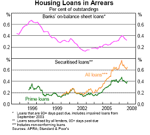
Source: Chart accompanying
presentation by Mr R Battellino, 24 April 2008.
3.24
Mr Battellino has also drawn attention to the distribution of the
increase in household debt, noting 'the rise to date has been overwhelmingly
driven by those households that had the greatest capacity to service it – the
middle‑aged, high‑income group'.[17]
3.25
Another factor that has helped indebted households stave off falling
into arrears is that in 2005 about half of them, including low income
households, had been ahead on their repayments (Chart 3.10). Around a quarter
of them are over a year ahead. As interest rates have risen, some of this
buffer may have been eroded.
Chart 3.10
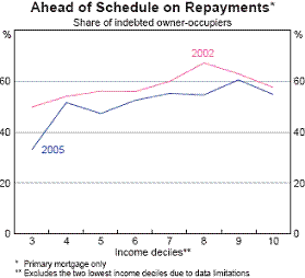
Source: Reserve Bank of Australia, Financial
Stability Review, March 2007, p. 27.
3.26
On the other hand, the low level of defaults and arrears may just be an indication
of how hard Australians try to hang onto their homes even at the expense of
scrimping in other 'essential' areas. A recent study of families that were in
'housing stress' in terms of the 30/40 measure found that many were taking
tough decisions to keep meeting housing costs (Table 3.2).
Table 3.2: Measures
taken by stressed households: per cent of respondents
|
|
Renters in lowest two income quartiles paying 30-40%
of income in rent |
Renters in lowest two income quartiles paying over 40%
of income in rent |
Home purchasers in lowest income quartile |
|
Sometimes going without meals
|
21 |
30 |
10 |
|
Sometimes unable to heat or cool home
|
44 |
57 |
24 |
|
Children have missed school excursions or sports
|
40 |
42 |
23 |
|
Children go without adequate health or dental care
|
35 |
39 |
18 |
|
Sold or pawned personal possessions
|
32 |
34 |
8 |
Source: abridged version of
table in Burke (2007, p. 3).
3.27
As one senator summarised the evidence:
a lot of the submissions and oral evidence we have received are
from community support agencies who are saying that what they are finding is an
exponential increase in the number of people who are accessing their services.
For many of them, paying their mortgage is the first thing they do, so then
they cannot put food on the table...Financial counselling services are reporting
a significant increase in the number of people accessing their services.[18]
3.28
As the Department of Families, Housing, Community Services and
Indigenous Affairs (FaHCSIA) pointed out:
there would also be a number of households where the householder
would actually know that they are in arrears and would choose to sell the house
before there is a formal foreclosure process, so they would not necessarily
appear in those statistics.[19]
3.29
As Professor Disney observed, there are also people suffering an
indirect form of housing stress:
They are the people who have only escaped paying above 30 per
cent of their income on mortgage or rents by living in very unsatisfactory
housing or a very long way away from the job they already have or the work
opportunities that they might need.[20]
Effects on home ownership rates
3.30
Another approach to assessing the 'affordability' of home ownership is
to examine home ownership rates. The overall rate dropped only marginally, from
66 to 65 per cent, between the 2001 and 2006 censuses.[21]
However, within this the proportion of households who own their home outright
(ie do not have a mortgage) dropped from 40 per cent to 33 per cent.[22]
3.31
The age of first home buyers is also increasing. Home ownership rates
for those aged under 35, and to a lesser extent other cohorts, have dropped. This
probably reflects a mix of changing preferences and affordability issues:
There might be various social factors as to why that is
happening—people are studying longer, they are getting married later and doing
all sorts of things later. So part of it is a social thing, but I suspect part
of it is also due to the fact that they are having trouble getting the deposit
to get into the housing market.[23]
3.32
Drops in home ownership rates within various age cohorts is consistent
with overall stability in the home ownership ratio as the aging of the
population moves more people into the older cohorts with high ownership ratios.[24]
3.33
There are concerns expressed that around a tenth of people reaching
retirement age have not paid off their mortgages, something very unusual for
previous generations.[25]
(This was discussed further in Chapter 2; see especially Chart 2.1.)
Regional aspects
3.34
Average house prices (and incomes) vary across the country, and
therefore so does affordability. Sydney has the most expensive housing in Australia
while Tasmania, South Australia and most rural areas have significantly cheaper
housing. The pattern of 'affordability' and 'mortgage stress' can be somewhat different,
though, as some areas with cheaper houses also have lower average incomes. For
example, the average house price in Hobart is 44 per cent below that in Sydney,
but the average household income is 26 per cent lower in Hobart than in Sydney.
3.35
As an example of the dispersion, some house price/income measures from Demographia
are given below (see also Chart 8.1).
Table 3.3: Selected median
house price / median household income ratios
|
More affordable
|
|
|
Less affordable
|
|
|
Ballarat-Bendigo
|
5.0
|
|
Sydney
|
8.6
|
|
Canberra
|
5.5
|
|
Gold Coast
|
8.6
|
|
Wagga Wagga
|
5.5
|
|
Perth
|
7.6
|
|
Launceston
|
5.7
|
|
Melbourne
|
7.3
|
Source: Demographia (2008).
3.36
There have also been significant differences in the growth in house
prices in different areas within cities. Using data at postcode level, Richards
(2008) shows:
In four of the five major capitals, average annual growth in
house prices within five kilometres of city centres has been about 2 percentage
points higher than for houses close to the edge of the cities.
International comparison
3.37
Over the past decade house prices have risen faster than incomes in a
number of comparable economies. However the increase has been more marked in Australia
than elsewhere and houses are now less affordable than in most comparable
economies.
Chart 3.11
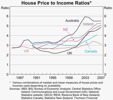
Source: Richards (2008).
Table 3.4: Selected
cities: median house price / median household income ratios
|
More affordable
|
|
|
Less affordable
|
|
|
Dallas
|
2.5
|
|
Los Angeles
|
11.5
|
|
Ottawa
|
3.0
|
|
Sydney
|
8.6
|
|
Manchester
|
5.2
|
|
London
|
7.7
|
|
Canberra
|
5.5
|
|
New York
|
7.0
|
Source: Demographia (2008).
3.38
Whether as a cause or a consequence of this, Australian households have
gone from having relatively low debt-to-income ratios to being relatively
highly geared. Debelle (2004) discusses the general global trend towards
greater household debt.
Chart 3.12

Chart 3.13
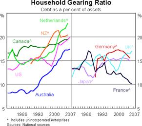
Source for Charts 3.12 and 3.13: Debelle (2008).
3.39
Housing may be less affordable in Australia than in otherwise comparable
countries due to Australia's population being unusually concentrated in the two
largest cities, with no 'middle-sized' cities (with populations between 500,000
and 1 million). This is discussed in more detail in chapter 11. Another
factor affecting international comparisons is that the Australian housing stock
primarily consists of detached dwellings.[26]
Distributional implications
3.40
It can be argued that higher house prices do not benefit the population
as a whole. But they clearly have distributional consequences. Richards (2008) comments:
Renters will be worse off when housing prices rise whereas those
who own rental property will be better off. Owner-occupiers may be largely
unaffected, since they can be thought of as being ‘hedged’ against increases in
the cost of housing. There are also generational differences. Younger people
who have not yet bought homes will be hurt by higher housing prices. Older
owner-occupiers may benefit from an increase in prices if they are intending to
extract part of the increased value of their homes... Both home ownership and
ownership of rental property tend to rise with incomes, so it is lower income
households that tend to suffer from rising housing prices and higher income
households that tend to gain.
Chart 3.14
Source: Richards
(2008).
Interpretation
3.41
While there is general agreement on the above picture of the average
Australian home now costing a larger proportion of income, there are widely
diverging interpretations of the causes, and hence the implications for policy.
3.42
One interpretation is that average house prices are higher just
because households, having become wealthier, now demand better houses. On this
view, the change in the affordability of a house of a constant quality
is overstated by the house price/income measures. There is something in this
argument. The average house sold today has more bedrooms, ensuite bathrooms have
become standard and fittings are of better quality. One estimate is that quality
improvements from alterations and additions could have boosted house prices by
around one per cent per annum over 1970–2003.[27]
On the other hand, there are some aspects in which land quality has
deteriorated. Gardens and yards have become smaller. And new homes in the
cities tend to be progressively further away from work, beaches and cultural
and recreational facilities.
3.43
It seems clear that the large rise in home prices mostly reflects an
increase in land prices, or the price of a good location. One indication is
that the cost of building houses has not risen much faster than the CPI[28],
whereas the cost of buying houses has risen a lot faster. Sale prices of vacant
land show sharp rises.
Table 3.5: Housing
cost increases, 1986–2006, annual average percentage change
|
Established house prices
|
7.5 |
|
Project homes
|
4.7 |
|
Materials used in house
building
|
3.3 |
|
Consumer price index
|
3.6 |
Source: Parliamentary Library
(2006).
3.44
Interpretations of the cause of high land prices differ. Asking whether
the current price reflects supply or demand is like asking which blade of a
pair of scissors is doing the cutting. But in looking at the increase in
prices over time, it is notable that most independent commentators view
increased demand as the prime influence. The reasons for increased
demand are discussed in Chapter 4. Others place more emphasis on restraints on supply,
and these are discussed in Chapter 5. Some commentators regard the impact of taxes
and charges as specifically important and they are discussed in Chapter 7.
3.45
The Productivity Commission's view was that:
the dominant source of the widespread escalation in
prices has been a general surge in demand' ... 'increased demand for better
quality and better located dwellings, rather than for more dwellings, has been
the primary driver of prices in the recent upswing... because recent price
increases have been due mainly to the surge in demand in established areas,
improvements to land release policies or planning approval processes could not
have greatly alleviated them.[29]
3.46
The Reserve Bank 'do not believe supply deficiencies at a macro level
are the main reason for the reduction in affordability for first home buyers'.[30]
It regards the common pattern of house price increases in countries which have
liberalised their financial systems, shown in Chart 3.11 above, as buttressing
this argument:
the widespread nature of the increases in
house prices makes it hard to attribute them to factors that have localised
effects, such as land usage policies and taxes. These sorts of factors are more
likely to have affected prices at the edges of urban development. I think the
big increase in the price of established houses, which has happened right
across Australia and
through most of the developed world, is mainly reflecting factors that relate
to demand and capacity to pay. The big factor here is increased household
access to finance. These forces, as I say, have been global in nature. They
have not been specific to Australia.[31]
3.47
In contrast, Demographia (2008) make it clear they regard supply as the most
important consideration. Writing in the introduction to their report, Don Brash
says:
Affordability of housing is overwhelmingly a function of just
one thing, the extent to which governments place artificial restrictions on the
supply of residential land.
3.48
Demographia support this argument by pointing out that in the US houses
are more affordable in cities such as Pittsburgh and Houston than in cities
such as New York and Los Angeles. Demographia argues that the former cities do
not place artificial restraints on the availability of land.
3.49
This argument has not gone unchallenged. Macquarie Bank's Rory Robertson
provides an alternative interpretation of Demographia's data:
homes in coastal locations with good job
opportunities and pleasant winters tend to be more expensive than homes in
inland centres where job prospects and winters are less ideal ... Much of the
affordable housing in the Western world is found in America's infamous 'Rust
Belt'.[32]
3.50
As noted above, in Australia's capital cities inner city house prices
have risen faster than those on the periphery, suggesting demand factors have
been more important than land supply policies. Price increases seem to have
rippled outwards from the city centres rather than inward from the urban
fringes.
3.51
This implies that measures to increase land supply on the urban fringe
or reduce prices of such land by reducing state and local government charges
(discussed in chapters 5 and 7 respectively) will have only a small impact on
measures of average affordability. Only a small proportion of homes are located
near the urban fringe. Most experts argue with the Reserve Bank that
In most circumstances, an increase in supply in outer areas is
likely to have only a relatively small effect on prices for houses in preferred
locations, including those close to the city.[33]
Estimates of the demand-supply imbalance
3.52
There seems to be a consensus that the 'underlying' demand for dwellings
is growing by around 180 000 dwellings a year, around 30 000 more than is the
stock of dwellings. Chart 3.15 shows this gap opened up a few years ago and is
forecast to continue.[34]
3.53
It is important to be clear about what this comparison measures. Underlying
demand for new housing is an estimate of the number of new dwellings that would
be needed based on past growth in population, migration (both long term
arrivals and short term visitors), living standards and the demolition of
existing housing. 'Underlying' (or 'notional' or 'potential') demand differs
from 'effective' demand, which is based not only on the desire for new housing
but also the ability and willingness of potential buyers to pay for it.[35]
As Dr Ronald Silverberg, Managing Director of the Housing Industry Association,
told the committee:
There is a gap in the order of 30,000 dwelling units between the
new housing supply and notional demand. The notional demand is built up on the
basis of demographic estimates. It is a useful reference point.[36]
Chart 3.15
Dwellings:
Completions v Demand
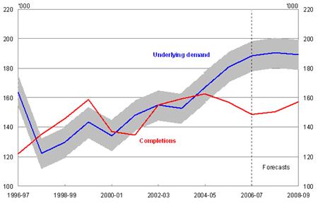
Source: Making Housing Affordable Again, Department of Families,
Housing, Community Services and Indigenous Affairs, March 2008.
3.54
One would expect that housing supply and effective demand for housing
would equilibrate through an adjustment in the market price. For reasons
discussed in Chapter 5, the supply of dwellings has not increased enough to
keep up with the recent increase in underlying demand. Prices have risen to
bring the increase in effective demand down below that in underlying demand. This
analysis would suggest that as soon as interest rates start to fall (unless
there is a recession), effective demand will increase and if supply does not
respond, house prices will rise further and the prospect of home purchase
recede further for some potential buyers. This will only be avoided if policy
changes act to remove impediments to increasing supply or reduce artificial
stimulants to demand. Such responses are the subject of latter chapters in this
report.
3.55
This inability of the supply of housing to keep pace with demand is also
evident from rental housing vacancy rates. FaHCSIA's March 2008 report 'Making
Housing Affordable Again' shows that in all capital cities, there has been a
pronounced fall in the available supply of rental housing since 2002.[37]
The Reserve Bank's May 2008 Statement on Monetary Policy noted that
vacancy rates are at historical lows at just over one per cent: a rate of
around three per cent 'is generally considered to indicate a reasonable
balanced rental market'.[38]
3.56
In the longer term, the underlying demand for housing may decelerate.
One projection has the demand for new houses dropping to under 110 000 in the
2020s, reflecting falling fertility, increasing baby boomer deaths and social
factors.[39]
Conclusion
3.57
There is consistent evidence that housing in Australia has become less
affordable in recent years and the number of households experiencing mortgage
stress has increased. There is also evidence that the number of households
defaulting on mortgages and homes being repossessed is not as high as these
figures might predict. Many families make tough decisions and go without to
meet mortgage payments; most families in housing stress take steps to move out
of housing stress within one to two years. Taken together, these factors stress
that it is important for policy makers to consider the support services offered
to families in housing stress and the range of options on offer to either help
them through a rough period, or help them move to more affordable housing
options. These issues are considered in more detail in chapters 9 and 10.
Navigation: Previous Page | Contents | Next Page