Chapter 2
The extent of income inequality in Australia
2.1
This chapter addresses the first term of reference for this inquiry: the
extent of income inequality in Australia and the rate at which it is
increasing. Income inequality can be measured in a variety of ways. Different
measures will yield different findings. Further, the same measure will yield a
different result depending on the data source that is used.
2.2
In evidence to the committee, Treasury stated that it is important to
consider a range of different indicators of income inequality rather than one
or two metrics. Further:
[T]here are alternatives to income which can be used to
measure equity, including the distribution of consumption and wellbeing, as
well as various measures of material deprivation. It is also necessary to
understand what is included or omitted from the analysis and also to consider
the impact of policies on opportunity.[1]
2.3
The committee notes that the underlying reasons for a change in the
level of inequality can be highly complex. As one submission noted, inequality:
...is affected by many factors, so that it can increase as a
result of beneficial changes as well as socially undesirable ones, and can
decrease because of changes that reduce overall social wellbeing as well as a
result of socially desirable changes.[2]
Measures of income inequality
2.4
In the course of this inquiry, the committee has received data and
research on a range of income inequality measures. These include:
-
the Gini coefficient;
-
the income share of a subset of the population (including the top
one per cent);
-
the ratio of income between different levels of income
distribution;
-
the share of the population with an income higher or lower than a
population median;
-
pre-tax and post-tax and transfer distributions; and
-
an individualised measure disaggregated from household data.
The Gini coefficient
2.5
Perhaps the best recognised measure of income inequality is the Gini
coefficient. This is a scale from 0 to 1 where 0 is where all incomes are equal
and 1 is where there is absolute inequality (ie: a single person has all the
income).
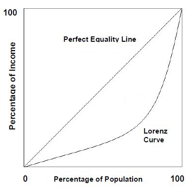
2.6
The Gini coefficient is calculated using the Lorenz curve. This curve
graphs the cumulative proportion of total income against the cumulative
proportion of the population from lowest to highest income. The curve starts at
0 and reaches a maximum of 1.[3]
A straight line would denote that everyone has the same income; inequality is
reflected in a convex curvature. The Gini coefficient is calculated through
dividing the area between the straight line of perfect equality and the actual
Lorenz curve by that area and the area under the Lorenz curve.
2.7
The Gini coefficient is used by the Organisation for Economic
Cooperation and Development (OECD) as a basis for international comparison.
Treasury told the committee that the Gini also allows for useful comparisons.
However, Treasury has also noted the limitations of the Gini:
...it does not tell us about changes in the distribution of
inequality between income groups, such as the top and the bottom...
a reduction in the Gini coefficient could result from a fall
in incomes at the top, without a corresponding rise in incomes at the bottom
(that is people becoming more equally poor).[4]
Income share
2.8
Points along the Lorenz curve indicate the ratio of people at different
ranks in the income distribution. Income share is another common measure of
income inequality. It can be expressed in terms of x per cent of households
holding y per cent of income. Often, reference is made to the income share of
the highest one per cent of the population.
The P90/P10 ratio and Q5/Q1 ratio
2.9
A third way to measure income inequality is by charting the ratio of
income at different ranks of the income distribution. For example, the P90/P10 ratio
is the income of the unit at the 90th percentile relative to that at the 10th
percentile. The higher the ratio, the greater the inequality. A variant of
this measure is the Q5/Q1 ratio: the ratio of the income share of the richest
20 per cent to that of the poorest 20 per cent. Again, the higher the ratio,
the greater the extent of inequality.[5]
2.10
Professor Alan Duncan of the Bankwest Curtin Economics Centre noted his
preference for using the income ratios to measure income inequality, as opposed
to the Gini coefficient. As he told the committee:
I think the metrics we present, which are based on income
ratios or income multiples, are actually far more accessible than, say, Gini
coefficients, which are the orthodox metric by which income inequality is
judged. The difference between 0.39 and 0.37 in a Gini coefficient means
essentially nothing...With income multiples, looking at the typical income in the
top 10 per cent of income distribution, in Australia the census was constructed
with a series of income bands, where the top income band of $2,000 per week or
more broadly speaking aligned with the top 10 per cent. For the bottom 10 per
cent, the income band that characterised the first decile stopped at around
$200 per week. When you are talking about income multiples say of the 90/10
ratio and how that has changed over time, if you look at something like a ratio
that is rounded up to five, then you are talking about the difference
between somebody who is on $2,000 a week and somebody who is on $400 a week.[6]
Relative income poverty
2.11
Some studies of income inequality use the concept of relative income
poverty.[7]
This is the share of the population with an income of less than 50 per cent of
the respective national median income.
Post-tax and transfers
2.12
The measurement of income inequality can also take into account pre-tax
and post-tax and transfer distributions. Studies sometimes compare the two,
showing the extent to which the tax and transfer system redistributes income.[8]
Most studies of income inequality focus on income after payment of income taxes
and receipt of government benefits.[9]
The Australian Bureau of Statistics (ABS) typically reports household income survey
data. This data includes social security benefits and deducts direct taxes and
adjusts for the number of people living in the household.
Equivalence
2.13
Income inequality is often measured at the household level using an
equivalence scale. This scale adjusts for household size and composition and
produces a 'per adult equivalent' measure of income.[10]
Australian studies into income inequality
2.14
In their submission to this inquiry, Professors Peter Whiteford and
Andrew Podger provide an overview of various academic studies of income
inequality in Australia over the past 20 years. The table they provide (Table
2.1) shows that most of these studies found that income inequality had
increased.
2.15
Professors Whiteford and Podger note that the studies employ a range of
data and methods to analyse inequality. The second column in Table 2.1 ('income
concept') shows that many Australian studies have used cash disposable income,
equivalised to provide a per-adult equivalent measure. Some studies have gone
beyond cash income to include the in-kind benefits of health, education,
housing and childcare. Associate Professor Roger Wilkins of the University
of Melbourne notes that these in‑kind transfers 'can be very important to
economic wellbeing and, moreover, when included in the definition of
income tend to reduce measured inequality'.[11]
2.16
In commenting on these research findings, Whiteford and Podger observe
that while 'the cumulative picture is of rising income inequality over the
longer run', there are some periods over which there are 'indications of
falling inequality'. They add that the concepts and measures used in these
studies 'can make a significant difference'.[12]
In similar vein, Professor Wilkins wrote in his submission: '[E]ach measure
provides different information on the income distribution, and ideally any
study of inequality will examine a battery of measures'.[13]
Table 2.1: Results of selected studies of inequality
in Australia
|
Study
|
Income
Concept
|
Period
|
Data
Source
|
Main
Results
|
|
Bradbury and Doyle 1992
|
Cash disposable income, equivalised
|
1983–84 to 1989–90
|
Microsimulation, IDS
|
Gini increased from .367 to .370
|
|
Gregory 1993
|
Individual gross earnings, not equivalised
|
1976 to 1990
|
Weekly Earnings of Employees (WEED)
|
Growth in low paid and high-paid jobs - the
‘disappearing middle’
|
|
Saunders 1993
|
Cash disposable income, equivalised
|
1981–82 to 1989–90
|
IDS
|
Gini increased from .27 to .29
|
|
Harding 1994
|
Gross income, equivalised
|
1981–82 to 1989–90
|
IDS
|
No change in Gini
|
|
Raskall and Urquhart 1994
|
Social wage income (health, schooling),
equivalised
|
1982–83 to 1989–90
|
Microsimulation, IDS
|
Gini increased from .272 to .276
|
|
Whiteford 1994
|
Cash disposable income, equivalised
|
1982–83 to 1989–90
|
Microsimulation, IDS
|
Gini fell from .328 to .319
|
|
Gregory and Hunter 1995
|
Gross household income of areas, not equivalised
|
1976 to 1991
|
Census
|
Gini increased from .14 to .18; incomes fell for
low-income areas between 1976 and 1981 and rose for rich between 1981 and
1991
|
|
Harding 1995
|
Social wage income (health, education, housing,
childcare), equivalised after housing
|
1994
|
Microsimulation, IDS
|
Gini for cash disposable income of .308, for final
income of .289
|
|
Johnson et al. 1995
|
A. Cash disposable income, equivalised
B. Social wage income (health, education, housing,
childcare, concessions), equivalised
|
1981–82 to 1993–94
|
Microsimulation, HES
|
A. Gini fell from .308 to .296
B. Gini fell from .255 to .226
|
|
OECD Atkinson et al. 1995
|
Cash disposable income, equivalised
|
1981–82 to 1985–86
|
IDS
|
Gini increased from .287 to .295; P90–P10 fell
from 4.05 to 4.01
|
|
ABS 1996
|
Final income (social wage plus indirect taxes),
not equivalised
|
1984 to 1993–94
|
Household Expenditure Survey (HES)
|
Q5–Q1 increased from 4.5 to 4.7
|
|
Borland and Wilkins 1996
|
Individual gross earnings, not equivalised
|
1975 to 1994
|
WEED; Income Distribution Survey (IDS)
|
Real weekly earnings of males fell at 10th
percentile and rose at 90th percentile
|
|
ABS 1999
|
Gini - gross income of income units
|
1994–95 to 1997–98
|
IDS
|
Income distribution of all income units almost
unchanged. Gini of .446 not significantly different from that of previous
years
|
|
Barrett et al. 1999
|
Consumption inequality
|
1975 to 1993
|
HES
|
Income and consumption inequality both rose,
income inequality grew much more than consumption inequality
|
|
Lloyd et al. 2000
|
Mean income by location
|
1986 to 1996
|
Census
|
Income of metropolitan residents increased double
the rate of those in major urban centres and regional towns. Between 1991 and
1996, rural towns had the largest increase
|
|
Saunders 2001
|
Wage and salary, market income, gross income,
disposable income and equivalent disposable
|
1990 to 1999–2000
|
IDS, and Survey of Income and Housing Costs
|
Wage and salary Gini increased from 0.224 in 1990
to 0.275 in 1999–00. Market Gini rose from 0.543 to 0.572. Gross Gini rose
from 0.427 to 0.445. Disposable Gini rose from 0.375 to 0.391. Equivalent
disposable Gini rose from 0.330 to 0.346. Australia 6th most
unequal country out of 20 in 1995
|
|
Harding and Greenwell, 2002
|
Disposable income and household expenditure
|
1984 to 1998-99
|
IDS, and Survey of Income and Housing Costs and
HES
|
Income inequality has been increasing ,but
current expenditure inequality has remained stable
|
|
Leigh, 2004
|
Taxable and disposable income
|
1942 to 2000
|
Taxation statistics
|
Inequality fell in the 1950s and the
1970s, and rose during the 1980s and 1990s – a pattern similar to the United
Kingdom.
|
|
Johnson and Wilkins, 2006
|
Private income, gross income, disposable income
and equivalent disposable and household expenditure
|
1982 to 1977-78
|
IDS and HES
|
Modest increase in inequality over 1980s and
1990s, with most of the increase being in early 1990s. Expenditure inequality
is lower but also increased.
|
|
Atkinson and Leigh, 2006
|
Taxable and disposable income
|
1921 to 2002
|
Taxation statistics
|
The income share of the richest fell
from the 1920s until the mid-1940s, rose briefly in the post-war decade, and
then declined until the early-1980s. During the 1980s and 1990s, top income
shares rose rapidly. At the start of the twenty-first century, the income
share of the richest was higher than it had been at any point in the previous
fifty years.
|
|
Austen and Redmond, 2010
|
Earnings inequality and household income
inequality
|
1982 to 2007
|
IDS
|
Male earnings inequality increased
substantially across this period, but change in family income inequality was
less significant. Women’s earnings played a role in moderating the effects of
rising male earnings inequality.
|
|
Doiron, 2011
|
Household disposable income
|
2000 to 2008
|
IDS
|
After
a decade of stable even slightly improving income inequality, Australia
suffered a sharp widening of its income distribution in the late 2000’s.
Although this U-turn is not unique to Australia, the change has seemed more
extreme with Australia’s rank in 30 OECD countries falling from 15 in 2004 to
24 in 2008 in terms of income equality.
|
|
Bray, 2014
|
Household disposable income
|
1990 to 2010
1976 to 2010
2001 to 2010
|
SIH
HES
HILDA
|
Rise
in inequality 1990 to 1994, fall to 1998, rise to 2000-01, then fall to 2004,
rise to 2008 then fall.
Fall
in inequality between 1976 and 1984, rise to 1993-94, fall to 2003-04 and
rise to 2008-09.
No
significant change in inequality between 2001 and 2010.
|
Source: Professor Peter Whiteford and Professor Andrew
Podger, Submission 55, pp 7–9. Note: The Gini coefficient ranges between
0 and 1 with a higher Gini implying greater inequality. The P90/P10 ratio is
the income of the unit at the 90th percentile relative to that at the 10th
percentile, with a higher ratio implying greater inequality. The Q5/Q1 ratio is
the ratio of the income share of the richest 20 per cent to that of the poorest
20 per cent, with a higher ratio implying greater inequality.
Table
reproduced with permission.
Australian Bureau of Statistics
data
2.17
ABS data on income inequality are principally derived from two surveys:
the Household, Income and Labour Dynamics in Australia Survey (HILDA) and
the Survey of Income and Housing (SIH).
The
Household, Income and Labour Dynamics in Australia Survey (HILDA)
The
Household, Income and Labour Dynamics in Australia Survey (HILDA) is a
longitudinal social and economic survey which tracks all members of an
initial sample of households in a series of interviews (waves) over an
indefinite life. HILDA is designed to collect data in three main areas:
economic and subjective well-being, labour market dynamics and family
dynamics. Topics covered in these areas include education, current
employment and employment history, job search experience, income, health
and well-being, child care, housing, family background, marital history and
family formation for those aged 15 years and over. Responsibility for the
design and management of the survey rests with the Melbourne Institute of
Applied Economic and Social Research. Commencing in 2001, HILDA collects
data annually.
http://www.abs.gov.au/ausstats/abs@.nsf/Lookup/3414.0main+features132011%20(Edition%202)
The Survey of Income and Housing
(SIH)
The
Survey of Income and Housing (SIH) (previously known as the Survey of
Income and Housing Costs (SIHC)) is a household survey which collects
information on sources of income, amounts received, housing
characteristics, household characteristics and personal characteristics.
Income is collected on both a current and financial year basis. In some
cycles from 2003-04, information on household net worth is also collected.
The survey scope covers residents of private dwellings in both urban and
rural areas of Australia. The survey was conducted for most years from
1994-95 to 2003-04 (no survey was run in 1998-99 or 2001-02), from which
year it is being conducted biennially.
http://www.abs.gov.au/ausstats/abs@.nsf/dossbytitle/F0CDB39ECC092711CA256BD00026C3D5?OpenDocument
Household wealth in Australia: ABS
Survey of Income and Housing
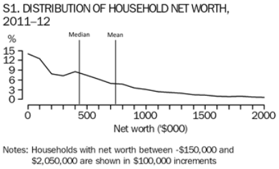
2.18
Based on its 2011–12 Survey of Income and Housing, the ABS has
highlighted the 'asymmetric distribution of wealth between households' in
Australia:
While the mean household net worth of all households in
Australia in 2011–12 was $728,000, the median (i.e. the mid-point when all
households are ranked in ascending order of net worth) was substantially lower
at $434,000. This difference reflects the asymmetric distribution of wealth
between households, where a relatively small number of households had high net
worth and a relatively large number of households had low net worth, as
illustrated in the following frequency distribution graph.[14]
Figure 2.1: Distribution of household net worth 2011–12 (ABS 2012)[15]
2.19
The ABS noted various other findings from the survey:
-
over 1.2 million households (14 per cent) had net worth less than
$50,000, with 114,000 of these households having negative net worth (1 per cent
of all households);
-
in 2011–12, households in the highest net worth quintile held
more than 60 per cent of the total net worth of all households, while a
further 21 per cent was held by households in the 4th quintile. By
comparison, the lowest three quintiles held, in total, 18 per cent of total net
worth;
-
the share of net worth held by the second net worth quintile has
decreased from 6.0 per cent in 2003–04 to 5.2 per cent in 2011–12. Also the
share of net worth held by the third net worth quintile has decreased from 12.7
per cent in 2003–04 to 12 per cent in 2011–12, and the share of net worth
held by the highest net worth quintile has increased from 59.0 per cent in
2003–04 to 60.8 per cent in 2011–12;[16]
-
the net worth of the households at the top of the 80th percentile
was 11.6 times higher than the net worth of the households at the top of
the 20th percentile (i.e. the ratio of the value of the top of P80 to the value
at the top of P20). The corresponding P80/P20 ratio for gross household income
was 4.5;
-
high net worth households had the highest incidence of home
ownership without a mortgage (59 per cent), whereas 91 per cent of the
households in the lowest net worth quintile were renters;
-
renters had lower mean net worth ($160,000) which is 22 per cent
of the average for all households. Private renters averaged net worth of $179,000,
while renters from state/territory housing authorities averaged net worth of
$43,000;
-
lone persons aged under 35 had the lowest mean household net
worth, at $160,000;
-
the mean household net worth of couple only households with a
reference person aged under 35 was $259,000. These couple only households had
more than twice the level of mean gross household income of the young lone
person household ($2,543 per week compared with $1,080 per week);
-
one parent, one family households with dependent children had a
mean net worth of $251,000, compared to $833,000 for couple family households
with dependent children; and
-
in 2011–12 Tasmanian households recorded the lowest mean net
worth at $601,000, or 17 per cent below the average for all Australian households.
Canberra (ACT) households had a mean net worth of $930,000, 19 per cent above
the capital city average of $781,000 and 28 per cent above the average for all
Australian households of $728,000.[17]
Long-run ABS data on income inequality
2.20
The Australian Council of Trade Unions (ACTU) and Professors Whiteford
and Podger present in their submissions a figure (Figure 2.2, below) plotting
the Gini coefficient in Australia from 1981–82 to 2011–12. There are two
different sources: a series from Johnson and Wilkins using old ABS data
and a series from 1994–95 using current ABS data.[18]
2.21
Professors Whiteford and Podger make the following observations on
Figure 2.2:
Despite the differences in income measures and equivalence
scales, the long run trend is clear. There are periods in which inequality fell
– 1986 to 1990, 1994-95 to 1996-97, and 1999-2000 to 2002-03, but overall
inequality measured by the Gini coefficient rose over 2000s, and 0.32-0.34 in
the mid and late 2000s. Over the most recent period since the Global Financial
Crisis, income inequality as measured by the Gini coefficient has fallen, but remains
higher than at any point before 2007-08.[19]
Figure 2.2: Income inequality in Australia, 1982 to 2011
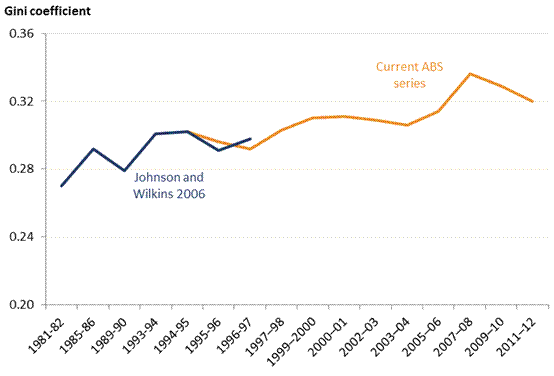
Source: Johnson and Wilkins (2006); ABS (various
years).
2.22
On the basis of Figure 2.2, the ACTU commented:
Australia’s Gini coefficient rose from 0.302 in 1994-95 to
0.336 in 2007‑08, an increase in inequality of around 11%. Between
2007-08, income inequality fell a little, with the Gini coefficient coming down
to 0.32. While this is lower than the level recorded in 2007-08, it remains higher
than the Gini at any time from 1994-95 to 2005-06 (inclusive). The decrease
in inequality since the GFC has been ascribed to causes including:
-
The economic stimulus packages of
2008-09, a large portion of which consisted of means tested cash transfers to
households;
-
The increase in pensions in 2009;
and
-
The post-GFC fall in income from
assets such as stocks, the ownership of which is concentrated among high-income
earners.[20]
Methodological concerns with the
ABS data
2.23
In a paper titled Evaluating the evidence on income inequality in
Australia in the 2000s, Professor Wilkins noted that there were technical
changes in the SIH methodology, which casts doubt on the results from the 2000s.
The paper's abstract states:
Published ABS data from the Survey of Income and Housing
(SIH) show a substantial increase in income inequality between 2001 and 2010.
However, almost all of the increase occurred over a period when changes in
survey methodology and income concept were occurring. I document these changes,
present results of analysis of the SIH unit record data, and present
independent evidence on income inequality trends using the HILDA Survey, tax
records and National Accounts. I conclude that the SIH overstates the growth in
income inequality, even when the income variable examined is notionally
consistently defined across surveys. The extent of overstatement is uncertain,
however, reflecting ambiguity about the nature and extent of changes to the
distribution of household market income.[21]
2.24
Professor Wilkins concludes:
We are therefore left with the somewhat unsatisfactory
conclusion that it is not possible to produce definitive estimates of income
inequality trends between 2001 and 2010. There are, however, some seemingly
unambiguous facts about income distribution changes over the decade. No data
source shows inequality decreasing, and indeed there is agreement between the
weekly SIH, annual SIH and the HILDA Survey that inequality increased from
approximately 2003‐04
to 2007‐08—albeit
by differing magnitudes— and then decreased in the next two years. In addition,
all three series show that changes to income taxes and to government benefits
acted to increase income inequality over the decade.[22]
2.25
The ACTU has noted that the ABS has 'improved its survey methodology
over time and harmonised its definition of income with the international
standard'. It argued:
This means that the recent estimates of the Gini coefficient
are more likely to be accurate than earlier estimates. Thus, to the extent that
the available figures overstate the rise in inequality, it is likely to be due
to an underestimate of inequality in earlier years rather than an overestimate
of inequality in later years. The ABS (and OECD) figures are used in this
submission, as those organisations are confident enough of the comparability of
the post-1994/95 estimates to present them as a time series, but the Committee
should be aware of the technical issues here.[23]
Income inequality and the
Australian States
2.26
A Treasury paper on income inequality (see below) provided the following
chart which plots the Gini coefficient for each of the six Australian States
from 1994–95 to 2011–12.
Figure 2.3: Gini coefficient for the States[24]
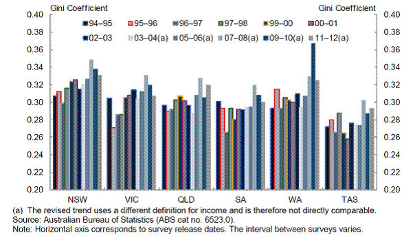
2.27
The chart shows that Gini coefficient trends followed a similar pattern
in the Australian States, with the exception of Western Australia. Unlike the
other States, income inequality has increased in Western Australia since 2007–08.
Treasury stated:
While further work is needed to better understand this trend,
it is likely that the increase in income inequality in Western Australia is due
to the impact of the mining boom in that state.[25]
2.28
The Bankwest Curtin Economics Centre has conducted research into the distribution
of income and the extent of hardship in the boom mining state of Western
Australia (WA). In its February 2014 report titled Sharing the boom: the
distribution of income and wealth in WA, the Centre found that:
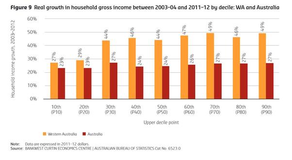
Between 2003–04 and 2011–12, all household income deciles in
Western Australia increased by considerably more than was experienced
nationally (Figure 9). The exceptions were those households in the first two
deciles (those with the lowest incomes) who experienced increases of 27 per
cent and 29 per cent respectively over the period. This compares with a
national increase of 23 per cent for the two bottom deciles.
Eight out of the ten income deciles in Western Australia have
experienced real growth rates of between 44 and 49 per cent in household gross
income between 2003–04 and 2011–12. This compares to national growth which
remained relatively flat across deciles over the boom period, at rates of
between 23 and 27 per cent. While the majority of WA households grew well ahead
of the national average, households in the bottom two deciles have kept pace
with national rather than WA incomes growth.[26]
2.29
Professor Duncan elaborated:
If you look at real incomes growth in WA compared to the rest
of Australia you find that, over the period between, say, 2003 and 2012, over
the last decade...the first two deciles in WA track pretty closely to the first
two deciles in the rest of Australia...
In deciles 3 to 10, you see a significantly greater degree of
incomes growth in WA than the rest of Australia. It is not just the lowest 10
percentile. We see the separation occurring around decile 3.[27]
Figure 2.4: Real growth in household gross income between 2003–04 and
2011–12 by decile: WA and Australia[28]
OECD data
2.30
Using the Gini coefficient, data from the OECD for Australia for the
period 2000–2012 shows that income inequality declined from 2000 to 2004,
increased from 2004 to 2008 and fell from 2008 to 2010 and again from 2010 to
2012. When compared with the OECD average, Australian income inequality
was marginally higher in 2000, 2008 and 2010. Over the period 2000–2012, the
United States recorded a Gini coefficient of between 0.36 and 0.39, while the
United Kingdom ranged from 0.33 to 0.35.[29]
2.31
In terms of the top decile of income earners relative to the lowest
decline, the multiple in Australia was 8.1 in 2000, falling to 7.7 in 2004
before rising sharply to 9.3 in 2008. It has fallen since and in 2012, the top
decile received 8.5 times the income of the bottom decile of income earners.
The OECD average was consistently higher on this measure.
2.32
In terms of relative income poverty, in 2000, 12.2 per cent of the
Australian population had an income that was less than 50 per cent of national
median income. This figure increased to 13.2 per cent in 2004, 14.6 per cent in
2008 before falling in 2010 and 2012. On this measure, in 2000, 2008 and 2010,
income inequality in Australia was more pronounced than the average across OECD
countries.[30]
Table 2.2: Income inequality in Australia and OECD averages, 2000–2012
|
|
Gini coefficient
|
Top 10% vs bottom 10%
|
Relative income poverty
|
|
|
Australia
|
OECD average
|
Australia
|
OECD average
|
Australia
|
OECD average
|
|
2000
|
.32
|
.31
|
8.1
|
9.2
|
12.2
|
10.5
|
|
2004
|
.31
|
|
7.7
|
|
13.2
|
|
|
2005
|
|
.32
|
|
9.4
|
|
|
|
2008
|
.34
|
.32
|
9.3
|
9.5
|
14.6
|
11.6
|
|
2010
|
.33
|
.32
|
8.9
|
9.8
|
14.4
|
11.7
|
|
2011
|
|
.32
|
|
9.8
|
|
11.7
|
|
2012
|
.32
|
|
8.5
|
|
13.8
|
|
Source:
Organization for Economic Cooperation and Development, 'Social and welfare
issues—Inequality', http://www.oecd.org/social/inequality.htm (accessed 10
November 2014)
2.33
Table 2.2 below shows trends in different income inequality measures in
each OECD country.[31]
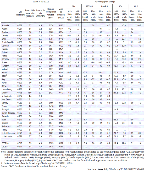
The table shows that in 2008:
-
only eight of the other 33 OECD countries had a higher Gini
coefficient than Australia—Chile, Mexico, Italy, Turkey, Israel, Portugal, the
United States and the United Kingdom; and
-
only 8 of the other 33 OECD countries had a higher S80/S20 share
ratio[32]
than Australia—Chile, Israel, Japan, Mexico, Portugal, Turkey, the US and the
UK.
2.34
Figure 2.5 is taken from the ACTU's submission to this inquiry. It shows
that while income inequality in Australia has increased since the mid-1990s,
the level of inequality (as measured by the Gini coefficient) has consistently
been below that in the United States and the United Kingdom.
Figure 2.5: Gini coefficient for equivalised disposable household income in
Australia, the US, the UK and Canada
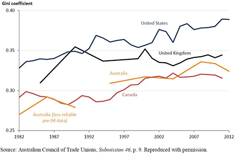
Source:
Australian Council of Trade Unions, Submission 46, p. 9. Reproduced with
permission.
Table 2.3: Trends in different income inequality measures (OECD 2011)[33]
Treasury's evidence on income inequality
2.35
In 2013, a Treasury paper on income inequality concluded:
...while labour income inequality has been on the decline,
overall income inequality in Australia has been rising since the mid-1990s.
Measures that focus on the very top income earners show a strong gain in their
share of national income, as is the case in most OECD countries.[34]
2.36
The Treasury paper contained the following chart, comparing income
inequality for households using the P90/P10 ratio, the P80/P20 ratio and the
P80/P50 ratio.
Figure 2.6: P90/P10, P80/P50 and P80/P20 ratios in Australia (1994–95 to
2011–12)[35]
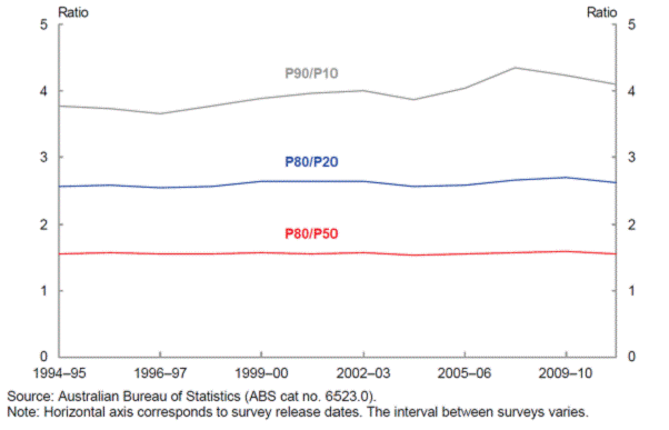
2.37
Treasury summarised the findings as follows:
...in 2011–12, a household at the 80th income percentile had
around 2.61 times the weekly household disposable income of a household at the
20th percentile and around 1.56 times the income of a household at the 50th
percentile. A household at the 90th percentile had around 4.1 times the weekly
household disposable income of a household at the 10th percentile.
Overall, between 1994–95 and 2011–12 the P80/P20 and the
P80/P50 ratios have been fairly steady, with periods of small variation.
The P90/P10 line shows a steeper upwards trend than the other
two data lines, with a pronounced drop occurring from 2007–08 to 2011–12.
These findings are similar to the trend in the Gini coefficient, and are
probably due to rises in investment incomes over this period which accrued
mostly to those at the top of the income distribution.[36]
2.38
Treasury emphasised that from 1994–95 until 2011–12, there has been real
household income growth across the income distribution, with the biggest gains
in the 40th, 80th and 90th percentiles.[37]
It added:
While
all of the household categories have experienced significant real income
growth, the biggest gains have gone to singles between the age of 55 and 64 and
couples without children, where both members are 55 or above and at least one
member is below 65.
2.39
Interestingly, a lone person of prime working age is the household type
that recorded the lowest real growth in disposable household income between
1994–95 and 2011–12.[38]
The 2013 Productivity Commission report
2.40
In 2013, the Productivity Commission (PC) released a report examining
income distribution trends in Australia between 1988–89 and 2009–10. The report
found that real incomes for most Australians grew in this period and that
higher growth in incomes for the higher deciles has led to a 'wider' spread of
incomes. This wider spread has led to an increase in the Gini coefficient.
In addition, the report found that:
-
for households in the top gross income deciles (8 to 10), labour
income growth appears to have been driven by higher wages;
-
for households in the bottom gross income deciles (2 to 4),
labour income growth has been driven by increased workforce participation and
employment, not wages;
-
while most Australian households do not report significant income
from this capital income, a few, primarily in the 10th decile, earn
large amounts; and
-
the equalising impact of taxes on household income distribution
has declined.[39]
2.41
Figure 2.7 shows that the distribution of income 'has shifted to the
right (indicating rising average incomes) and flattened (indicating greater
spread of income), the 'top' tail of the distribution has also lengthened'.[40] In 1988–89,
most households earned an income of $250–1250 per week with a small
percentage earning more than $1500 per week. In 2009–10, most individuals
earned an income of $250–1750 per week with a much larger number earning more
than $1750 per week.[41]
Figure 2.7: Movements in the distribution of individual labour income, 1988–89
to 2009–10
Source: Australian Government Productivity Commission, Trends
in the Distribution of Income in Australia, Staff Working Paper, March
2013, p. 7. Reproduced with permission.
2.42
Cumulative income growth from 1988–89 to 2009–10 is indicated for each
decile group in Figure 2.8. A clear gradient of growth from decile 2 to decile
10 can be seen in which lower income groups recorded substantially lower income
growth than the higher deciles. This is consistent with the PC finding that
those on higher incomes are realising higher wages growth, whilst lower income
individuals are simply working more hours with less wages growth. The higher
growth in decile 1 was largely accounted for by increases in government
payments reflecting the highly targeted nature of the welfare system (see
chapter 6).[42]
Figure 2.8: The percentage change in
labour income decile from 1988–89 to 2009–10

Source: Australian
Government Productivity Commission, Trends in the Distribution of Income in
Australia, Staff Working Paper, March 2013, p. 7. Reproduced with
permission.
2.43
The PC has compared the Gini coefficient for three different types of
incomes—capital, market and labour—seen in Figure 2.9 below. Most literature
focuses on labour income (wages and salary) where the Gini has increased from
0.39 to 0.43 (pre-tax and transfer). Market based income which includes wages,
salaries, self-employment and other business income has a much higher Gini, and
as such, higher levels of inequality. For example, the self-employed have a Gini
of 0.59. The highest level of income inequality occurs amongst those
receiving income streams from capital. Over the last two decades, the Gini has
ranged from 0.8 to 1.2. This is consistent with the PC finding that most
capital income accrues to the top decile.[43]
Figure 2.9: Gini coefficients for capital, market and labour income
Source: Australian
Government Productivity Commission, Trends in the Distribution of Income in
Australia, Staff Working Paper, March 2013, p. 7. Reproduced with
permission.
2.44
The PC found that Australia had the third highest increase in Gini coefficient
out of 19 OECD countries between 2000 and 2008.[44] Contributing to this is
that 'the redistributive impact of direct government payments and taxes has
fallen in Australia over the last decade'.[45]
The top 1 per cent income share
2.45
Another measure of inequality is to compare the earnings of the top one
per cent of income earners with the rest of the population. Figure 2.10 is
drawn from Treasury's paper. It shows that since the early 1980s, there has
been a progressive increase in the income share of the top 1 per cent, 0.5 per
cent and 0.1 per cent of Australians. Over this period, the share of income
held by the top one per cent of earners increased from around 5 per cent to
nine per cent.
Figure 2.10: Income share of the top 1, 0.5 and 0.1 per cent in Australia
from 1921–2010[46]

Wealth at the very top
2.46
The gains of the very wealthy have been greater. In his book, Battlers
and Billionaires, the federal Labor MP and former academic economist, the
Hon. Andrew Leigh MP, wrote:
The share of Australian wealth held by the super-rich is
steadily rising. Pamela Katic and I estimated that from 1984 to 2012, the
richest 0.001 per cent more than tripled their share of household
wealth from 0.8 per cent to 2.8 per cent. Over the same period, the top
0.0001 per cent (the richest one-millionth) quintupled their share from 0.25 to
1.4 per cent.[47]
Submitters' and witnesses' views on poverty in Australia
2.47
Another way to approach the measurement of inequality is through qualitative,
survey-based research into the extent of poverty, particularly in a wealthy
economy such as Australia's. The committee has taken evidence from submitters
and witnesses who noted, in the past few years, poverty and income inequality
have increased in Australia.
2.48
In Western Australia, for example, Professor Duncan referred
to two research reports released by Bankwest Curtin Economics Centre in 2014.[48]
He summarised this work as follows:
WA stayed strong during the course of the economic downturn
that has weakened most world economies. The resources boom in particular has
benefited the majority of WA households, with rising employment and substantial
increases in real income and household net wealth. However, the centre's
research does find that lower income households in WA have failed to keep pace
with the general growth in incomes for the rest of the population. There have
been real gains, financially at least, among the lowest income households but
they have not been able to share the benefits of the growth in incomes to the
same extent as those higher up the income distribution in WA.
Specifically, relative income inequality has risen in WA at a
greater rate than for the rest of Australia. The gap between the richest and
poorest households in WA rose consistently from the acceleration of the boom in
around 2003 to its peak in 2009...One metric we use is the 90:10 ratio, which
compares the incomes of the top 10 per cent of households with those at the
bottom 10 per cent of the income distribution. Expressed in those terms, in WA
the ratio of household equivalised disposable income of the richest 10 per cent
rose to 4.8 times the incomes of the poorest 10 per cent. That is a substantial
increase over the period from 2003 to 2009–10, which was at the height of the
boom. The figure currently has fallen slightly to 4.5 times, and this compares
with a rate of no more than 3.7 times income in 2003.[49]
2.49
Dr Ian Goodwin-Smith from the Australian Centre for Community Services
Research at Flinders University referred to the aphorism that 'a rising tide
lifts all boats'. However, he said:
It is true to say that there is a rising tide and it is also
true to say that it is lifting most of the boats. Even if we ignore those boats
which are not being lifted—and there are plenty of them—the important point is
that it is not lifting all boats at the same rate. It is a funny tide. In fact,
I do not think tides are a very good analogy at all because you do not get
tides like that at all. It is very bumpy. What that means is that there
continues to be a growth in inequality and disparity of income.[50]
2.50
A South Australian Council of Social Service representative said:
...the evidence suggests that the largest share of [income] growth
has been disproportionately captured by those who already have the most
resources...we are very aware that rising inequality means increasing levels of
poverty, especially for any household or individual whose income does not
maintain parity with real living costs.[51]
2.51
Professor David Morawetz from Australia21 similarly explained:
The richest 20 per cent of households in Australia now
account for 61 per cent of total household net worth, whereas the poorest 20
per cent of households account for just one per cent of the total. In the last
decade, the richest 10 per cent of Australians enjoyed almost half of the
growth in incomes, and the richest one per cent received 22 per cent of the
gains from growth. At the same time, despite 23 years of uninterrupted economic
growth, many of those currently dependent on government benefits, including
those on Newstart unemployment benefits, are forced to live well below the
poverty line. The poverty line in 2010 for a couple with two children was $27
per person per day, and that has to cover rent, food, clothing, transport,
medical expenses, everything—$27 per person per day. Scandalously, one child in
six in Australia now lives below this poverty line.[52]
2.52
UnitingCare Australia and the St. Vincent de Paul Society National
Council indicated, that across their networks, there is more need at the coal
face than has previously been the case. Dr John Falzon said that this was a clear
manifestation of growing inequality.[53]
2.53
Reverend Bill Crews, who runs UnitingCare Australia's mission in
Ashfield (Sydney), provided the following illustration:
We run a loaves and fishes free restaurant, which is open for
breakfast, lunch and then we have a mobile food van. We are now preparing and
delivering 1,000 meals a day every day. We started 25 years ago by delivering
maybe 80. We only target the poorest of the poor and what we find is that they
are people generally who have slipped between the cracks...We have an old couple
who contacted us about a year ago, they are living on pancakes because they
have got disabled children or grandchildren. We regularly find people coming
into our restaurant who might be on benefits, but after they have paid medical
expenses, transport and whatever they have got less than 50c a day to spend on
food. We find that over and over again...On different days, we will give out a
$25 food voucher to the guests in some of our restaurants and particularly the
men will say: 'Don't give it to me. Give mine to her. She's got these kids. She
can take mine as well.' I can go on and on about inequality.[54]
2.54
The Department of Social Services has advised that the Australian
Government's funding allocation for emergency relief (including Foodbank
Australia)[55]
has been reduced from $57.457 million in 2013–14 to $50 million in 2014–15,
reflecting a reduction in the number of requests for assistance.[56]
2.55
Some witnesses disputed that there has been any such reduction and advised
that demand for assistance from community service organisations has risen.[57]
A representative from Anglicare WA said:
Our clients, the people we see every day, are living in
challenging times and, despite recent years of high economic growth and low unemployment
[in] Western Australia, many of our clients have missed out on the benefits of
the boom. Aboriginal communities in particular have seen the boom go by. Our
contacts for emergency relief have doubled over the last two years to more than
10,000 people in 2013-14. In the areas of emergency relief, food insecurity and
housing, we see that people on benefits in particular and those on minimum
wages are increasingly being swept into crisis. Issues of homelessness, food
insecurity and social exclusion travel with people on low incomes.[58]
2.56
During the course of the inquiry, Foodbank Australia released its annual
report into the 'largely hidden problem of hunger in our community'.[59]
The highlights of the report are shown in Diagram 2.1 below.
2.57
The Foodbank Hunger Report 2014 stated that demand for food
relief continues to rise, including:
-
an eight per cent increase in the number of people seeking food
relief;
-
more than 60 per cent of agencies faced an increase in demand;
and
-
more than 20 per cent of agencies faced increases of over 15 per
cent in demand.[60]
2.58
The Tasmanian Council of Social Service (TASCOSS) indicated that poverty
is widespread and is a particularly serious issue for that state, which has the
highest proportion of people in the lowest income quintile (32 per cent):
It is estimated that over 14,000 Tasmanian children live in
poverty. If we use 50 per cent of median income as a poverty line measure, 14
per cent of Tasmanians live below that poverty line. About one-third of
Tasmanians rely on Commonwealth pensions and allowances for their main source
of income, and this is the highest percentage of all Australian jurisdictions.
Of the recipients of Commonwealth pensions and allowances, 37 per cent of
those people live below the poverty line, and that percentage is largely made
up of Newstart and Youth Allowance recipients.[61]
2.59
Chapter 6 of this report recommends that the Commonwealth Government
urgently review the amount allocated for emergency relief funding to ensure
that Australian in need are able to access assistance.
Diagram 2.1: Highlights of the Foodbank Hunger Report 2014

Source: Foodbank Australia, Foodbank Hunger Report 2014, http://www.foodbankwa.org.au/hunger-in-wa/the-hunger-report/
(accessed 18 November 2014).
Social mobility
2.60
The committee received evidence that income inequality leads to a lack
of social mobility, particularly for those living in poverty. In their
submission, Professors Peter Whiteford and Andrew Podger said that:
In considering income mobility by initial location in the
income distribution, they found that 55.5 per cent of those in the bottom
quintile in 2001 were also in the bottom quintile in 2009; 20.9 per cent were
in the second quintile, 11.9 per cent were in the third quintile, 6.2 per cent
were in the fourth quintile and 5.5 per cent were in the top quintile. Most
people do not move more than one quintile, but equally, relatively few remain
in the same quintile. However, the proportions remaining in the top and bottom
quintiles are relatively high, at 55.5 per cent for the bottom quintile and 46
per cent for the top quintile.[62]
This evidence shows those on low incomes—especially in the
bottom quintile—are unlikely to earn an income that places them in a higher
income quintile.
2.61
The issue of poor intergenerational social mobility was also discussed
in evidence to the committee. Although Australia compares favourably against
the United States on the elasticity of earnings from fathers to sons, there is
'an appreciable level of inequality of opportunity in Australia'.[63]
Mr Matt Cowgill of the ACTU, noted that the correlation between income
inequality and intergenerational social mobility:
...is nowadays referred to as the Gatsby curve...[T]here is
certainly an interdependent relationship between inequality of income in one
generation and social mobility over the generations. There is an interdependence
there and a correlation there that is not yet fully understood and unpacked,
but I think it is quite likely to work in both directions. We highlighted
earlier that societies which are less equal in one generation are likely to
have less social mobility over time. It is probably also the case that there is
some kind of causality working the other way, and that societies which have
less mobility over time in which people are less able to achieve their
potential are likely to have higher levels of income inequality.[64]
Mr Cowgill continued:
[C]ountries that are more unequal within one generation tend
to have lower social mobility across the generations. If you are born into a
society that is highly unequal and you are from a relatively poor background,
you are less likely to reach up to the middle or higher income levels when you
become an adult than if you were born into comparable circumstances in a more
equal society. So that distinction between inequality of outcome and inequality
of opportunity is largely false. Clearly we are not advocating for complete
equality of outcome. But, by the same token, saying that we should ignore the
level of income inequality I think ignores the fact that those things are
related.[65]
2.62
This evidence shows that the children of those living in poverty are
more likely to remain in poverty. Ms Kasy Chambers, the Executive Director of
Anglicare Australia, explained the factors that lead to this outcome:
One of the things that concern[s] us and that we see
happening increasingly is the lack of social mobility. When children are
excluded from education or, as we talk about in our submission, where one child
was going to his eighth school in seven years, that is clearly going to affect
that child's chances. Even if he makes it through, it would have meant he would
have been brilliant if he had not had that kind of disruption very early in his
childhood. We would argue that once inequality starts to restrict social
mobility, that is when it becomes far too concrete for us as a society to
accept.[66]
2.63
The committee considers that there is need for more research into
matters of intergenerational social mobility in Australia.
Conclusion
2.64
This chapter has discussed some of the major research findings on the
extent of income inequality in Australia. On a number of metrics, the evidence
indicates that income inequality has increased in Australia against the
backdrop of rising incomes across all income deciles. The incomes of those in
the deciles may have increased but to a lesser extent than those in higher
deciles.
2.65
Fast paced economic and income growth has increased income inequality, as
the Western Australian example shows. In WA, the gross household income of
the top eight deciles increased by an average 46.5 per cent between 2003–04 and
2011–12 (compared with 26 per cent nationally). In comparison, the bottom two
deciles only increased their income by an average of 28 per cent (compared with
23 per cent nationally).
2.66
The committee is particularly concerned with anecdotal evidence that the
incidence and severity of poverty is increasing in Australia. It draws
attention to Reverend Crews' evidence regarding the demand for food experienced
at one community centre and Foodbank Australia's report revealing that
nationwide 516 000 people rely on food services each month (35 per cent of
whom are children).[67]
Even in a country that has experienced 15 years of uninterrupted economic
growth and one of the highest living standards in the world, there is severe
hardship.
Navigation: Previous Page | Contents | Next Page